
With our location just a stone’s throw away from Shoreditch, it was a natural step to bring our school to life with painted and graffiti murals.
It’s really important for us that our murals aren’t simply pretty pieces of artwork that brighten up the school. All of our murals have a story behind them, inspire curiosity, and feature elements that can be woven into our children’s everyday learning.
Find out more about:
- The Everyday Adventure in London mural
- The Staircase Flowerscape mural
- The Lyceum Tube Stop mural
- The Repeating Pattern mural
Everyday Adventure in London
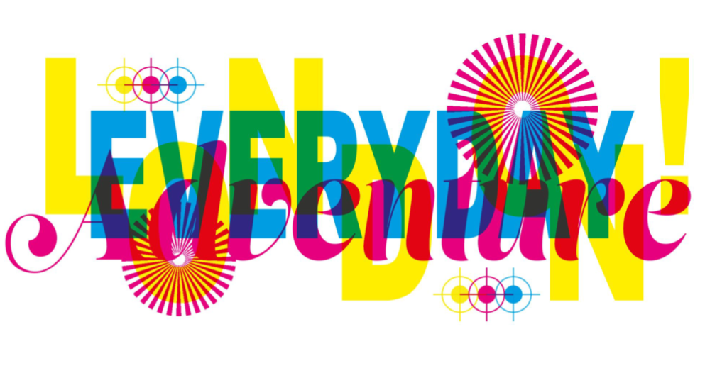
For this mural, we wanted to find a less literal way of representing the ethos of the school than painting pictures. Inspired by the printing press that was historically located in the building, we played around with a letterpress style to create an abstract word-art collage, with colour overlays, varied scales throughout the mural, and some reminders of the school’s ethos.
It also uses the traditional CMYK colour printing process used by printing companies, publishers, artists and graphic designers to create magazines, newspapers, business cards, flyers and pretty much all other printed materials.
CMYK is an acronym for the four colours used in printing with each letter standing for one colour.
C: Cyan M: Magenta Y: Yellow K: Black
Black’s abbreviation is K, which stands for key. When the other three colours are aligned they mix to create a black plate or key line.
The symbols are print marks used in the printing process.
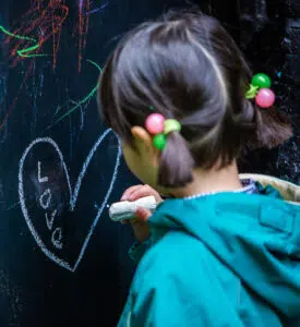
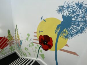
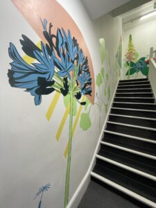
Staircase Flowerscape
This idea started by thinking about how we bring depictions of nature into the school, but at The Lyceum we love to do things a little differently. So, we thought about including some more abstract graphics and shapes in the background to create some dynamic movement within the composition, breaking up the flowers and giving the design a gender-neutral edge.
We wanted to include local plant life, and this concept also speaks to the environmental issues close to our heart, as well as serving as a natural contrast to our urban environment.
A flow of oversized flowers overlapping geometric shapes grows up the staircase and a single dandelion clock at the stop of the staircase is shedding its seeds, which can be seen floating downwards throughout the whole mural. The bold colours, exaggerated scale and solid geometric shapes make for a beautifully natural yet gender neutral, immersive composition.
The design also plays with scale and perspective, inspiring our pupils to consider their own size and relationship with nature. Does the mural look the same to a child in Reception as it does in Year 6? What would these plants in real life look like to a bee or a butterfly?
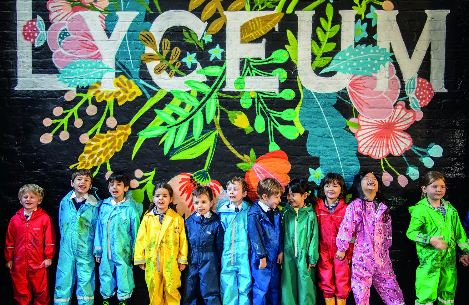
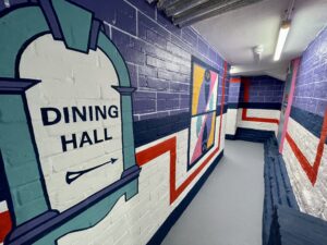
The Lyceum Tube Stop Mural
One of our collective favourites at school, we turned our dining hall corridor from plain white into a fantastic tube stop inspired mural full of colour. Each of the elements also have a lovely link to the school – can you figure out what they are?
Throughout the mural we have combined The Lyceum’s colours with the iconic London Underground shade of red and created a bold yet simplistic underground style tiled framework.
It includes wayfinding inspired by those iconic ‘way out’ signs used across London’s platforms and tiled artworks inspired by the hidden meanings found in the tiled designs found across the London Underground.
 Wayfinders and The Lyceum Owl
For the first underground artwork we chose to represent the iconic Lyceum Owl.
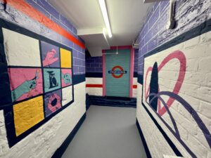
Location
Celebrating the school’s unique location in the heart of a triangle of finance, creativity and tech, this abstract composition on the right represents the Gherkin from The City, the railway bridge of Shoreditch and the structure on Old Street Roundabout.
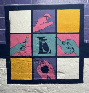
Our Values
Our school is founded on the four pillars of kindness, creativity, confidence and community, we wanted to bring these to life in visual form.
Centre-top you will see ‘confidence’ in British Sign Language, a small nod to the sign and sign lessons delivered by our fabulous Music Teacher Mrs McGovern.
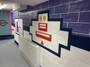 Transport
Could you guess what this design represents?
This abstract design is inspired by the modes of transport used to get to the school. From the top down: The circles represent bikes/scooters, the one below represents buses, then the tube/trains and finally walking. When placed together, the symbols create a delightful grinning character.
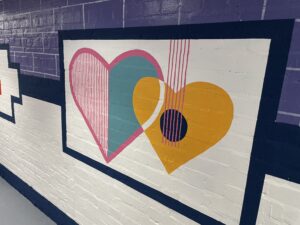 Music in our hearts
This design celebrates The Lyceum’s love for music. On the left we have a harp and on the right, a guitar.
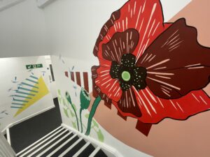
Repeating Pattern Mural
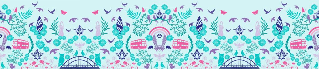
This impressive mural spans the entire width and height of the wall bordering the astroturf, filling the space with colour.
Born out of a stencil workshop our pupils had with graffiti artists in 2021, this mural leaves a lovely legacy behind of our children’s creativity.
The concept began by looking at William Morris inspired repeating patterns, morphing into the London and nature themed elements you now see.
For our children, we use this mural to explore lines of symmetry and some brain teasers. Which parts of the mural aren’t symmetrical? Why do you think the 4 busses have different numbers?
We also purposefully altered some of the elements – can you spot them? Our children are surprisingly quick at it!